The Ultimate Service Landing Page Structure That Converts in 2026
Discover the proven service landing page structure that converts visitors into customers. Complete guide with sections, psychology, and 2026 best practices.
 Written byPrithvi Jadwani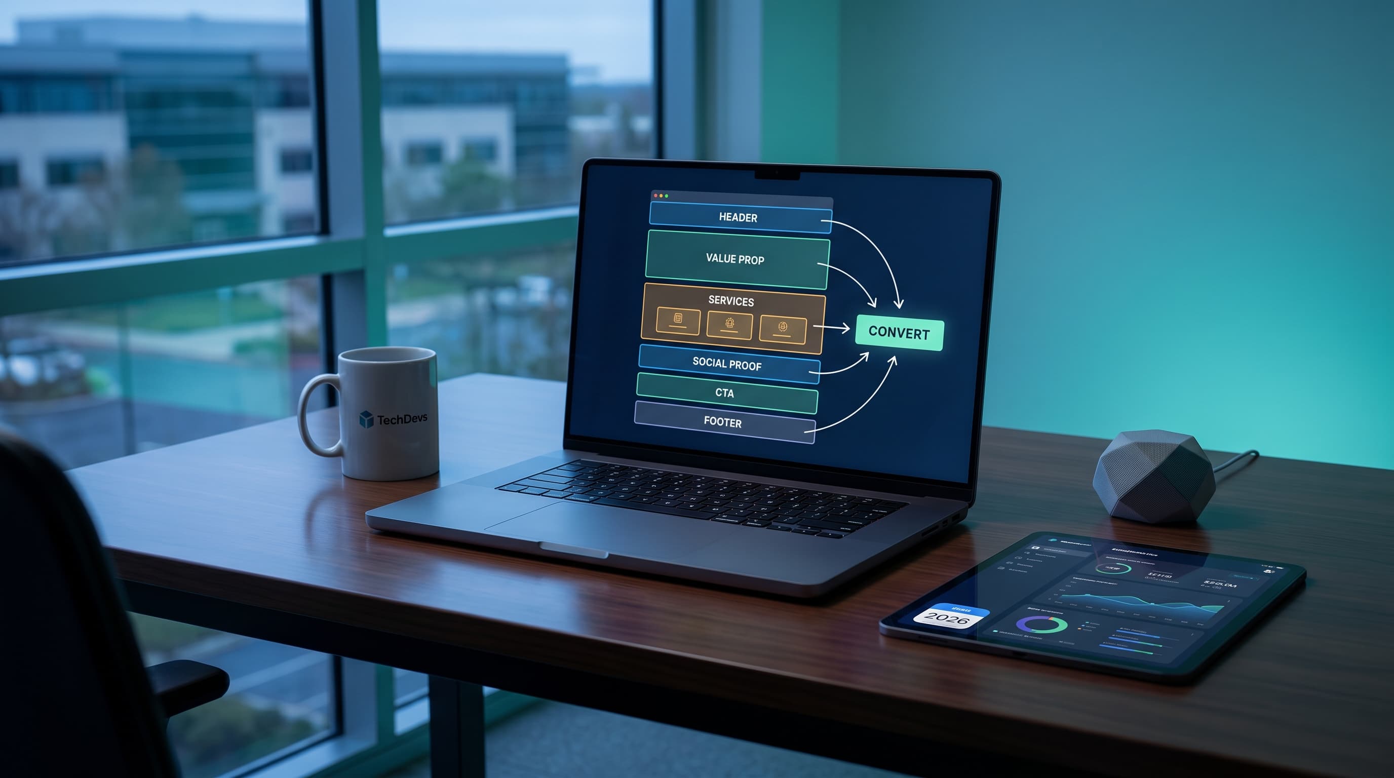
Table of contents
Summarize this article with AI
TL;DR
Most service landing pages waste 88% of their traffic with conversion rates stuck at 2.35%. The best ones hit 11% or higher by following proven psychological principles, clear structural frameworks, and ruthless focus on a single conversion goal. This guide shows you exactly how to build pages that turn visitors into customers.
- Single Goal Wins. High-converting pages focus on ONE action. Multiple CTAs kill conversions by creating decision paralysis.
- Speed Matters More Than You Think. A 1-second delay in page load time reduces conversions by 7%. Fast pages convert, slow pages bleed revenue.
- Message Match Is Everything. The ad promised something specific. Your landing page must deliver that exact thing, or visitors bounce immediately.
- Trust Before Action. Social proof, real testimonials, and visible credentials build the psychological safety needed for conversions.
- Good UX = 200% More Conversions. Design isn't decoration. Proper UX/UI can more than double your conversion rate by reducing friction and cognitive load.
Why Service Landing Pages Are Your Most Valuable Conversion Asset
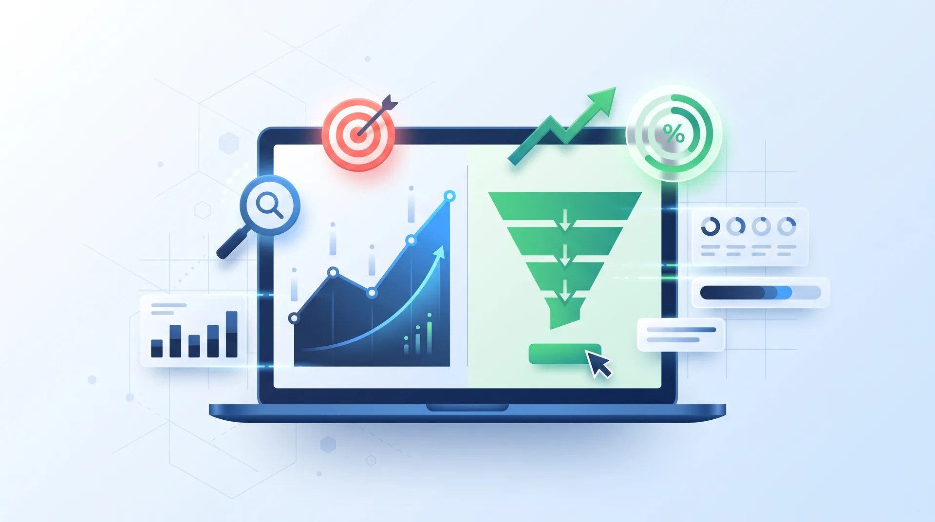
According to WordStream research, the average landing page conversion rate sits at 2.35%. Top performers? They hit 11% or higher. That gap represents millions in lost revenue for most businesses.
Here's what nobody tells you: the problem isn't your traffic. It's not your offer. It's the page itself.
Most companies obsess over ad click-through rates while completely ignoring the page that decides whether those clicks are worth anything. They pour budget into driving traffic to pages that were slapped together in an afternoon, with no strategy, no structure, and no understanding of how people actually make buying decisions online.
Service landing pages are different from product pages. You're not selling a thing someone can hold or a feature they can test. You're selling outcomes, transformation, and trust. That requires a completely different approach.
The Psychology Behind High-Converting Service Landing Pages
People don't make buying decisions logically. They make them emotionally and justify them with logic later. Understanding this is the foundation of every high-converting landing page.
Message matching is the first psychological principle most pages violate. If your ad promises a free audit, your landing page better open with that exact offer. Not a vague headline about "transforming your business." The brain is looking for continuity. Break that continuity, and you've lost the visitor in the first three seconds.
Then there's cognitive load. Every extra choice, every competing visual element, every unnecessary word increases the mental effort required to take action. Research shows that good UX/UI design can boost conversion rates by over 200% simply by reducing this friction.
Social Proof
We look to others to validate our decisions. Real testimonials, recognizable client logos, and specific case studies trigger this deeply wired instinct.
Authority Signals
Certifications, awards, years in business, and media mentions build credibility. They answer the question: 'Why should I trust you?'
Scarcity & Urgency
Limited spots, time-bound offers, or exclusive access tap into loss aversion. But fake scarcity backfires hard. Use it honestly or not at all.
Reciprocity
Give something valuable upfront (a guide, audit, tool) and people feel compelled to reciprocate. It's why lead magnets work.
Trust is the invisible barrier between interest and action. Service purchases involve risk. You're asking someone to hand over money for something they can't touch, test, or return easily. Every element on your page either builds trust or erodes it.
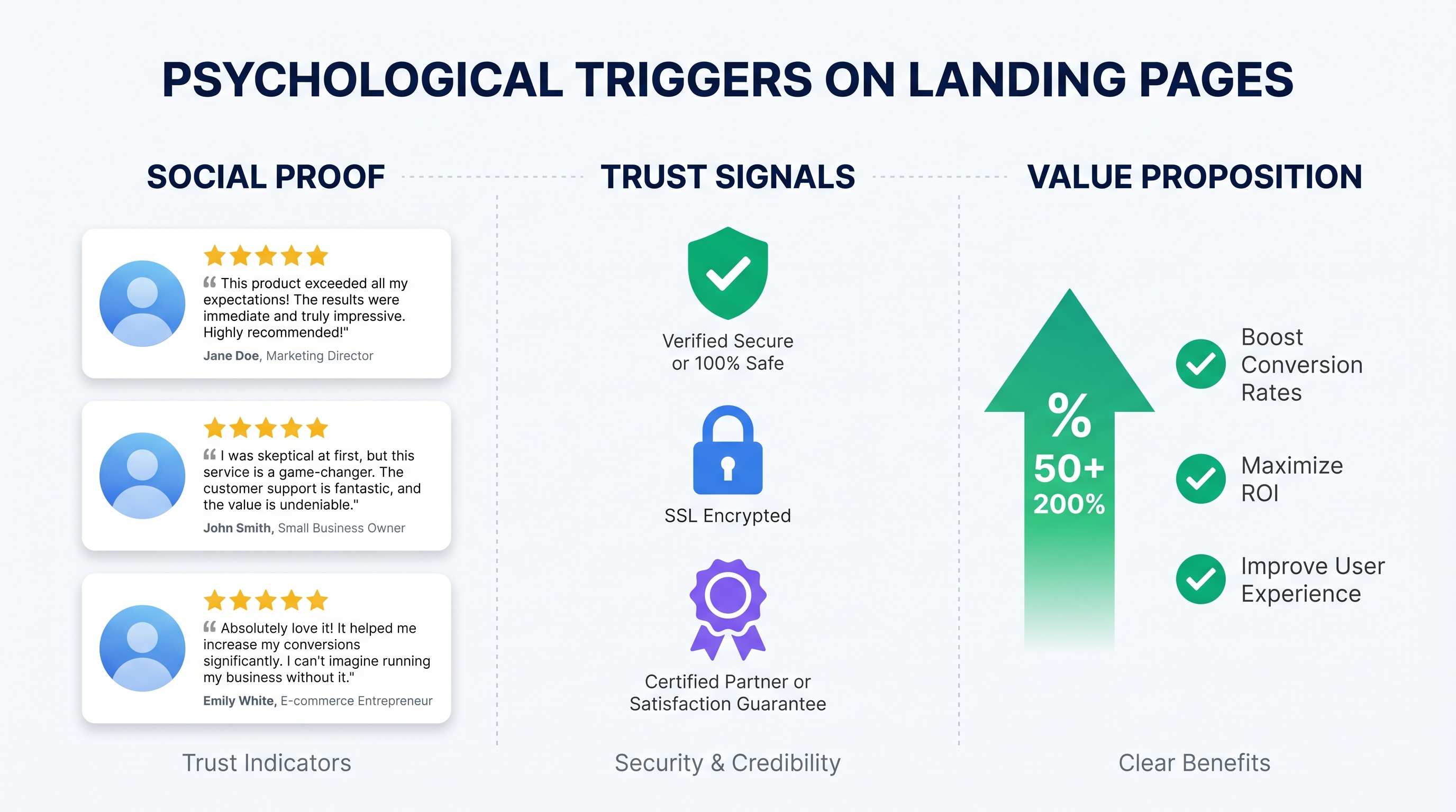
Poor user experience drives away 88% of online consumers. That's not a design problem. That's a revenue problem.
Think with Google, User Experience Research
The Complete High-Converting Service Landing Page Structure
Every high-converting service landing page follows a proven structure. Not because someone decided it looked nice, but because it maps to how people actually process information and make decisions.
Start with the hero section. This is your three-second pitch. The headline should state a clear outcome or solve a specific problem. Not "We help businesses grow" but "Get 40% more qualified leads in 90 days without increasing ad spend." Specific. Outcome-focused. Believable.
Essential Landing Page Sections Breakdown
Hero Section: What Goes Above the Fold?
Your headline (benefit-driven, specific), supporting subheadline (adds credibility or addresses objections), primary CTA button (action-oriented, clear), and optionally a hero image or short video. This section has one job: make visitors want to scroll.
Problem-Solution Framework: How Do You Structure It?
Start by acknowledging the visitor's pain point in their language. Then present your service as the bridge between their current state and desired outcome. Use specific scenarios they'll recognize. Avoid generic problems like 'businesses struggle with growth.'
Benefits vs Features: What's the Difference?
Features are what your service includes. Benefits are what those features do for the customer. 'Weekly reporting' is a feature. 'Know exactly which campaigns are profitable every Monday morning' is a benefit. Always lead with benefits.
Social Proof Section: What Actually Works?
Specific testimonials with full names, photos, and company details. Video testimonials perform even better. Case studies with real numbers. Client logos from recognizable brands. Avoid generic 5-star ratings with no context.
How It Works: Why Include This?
This section reduces friction by showing exactly what happens after they sign up. People fear the unknown. A clear 3-5 step process (with realistic timelines) removes that fear and makes the service feel tangible and achievable.
Pricing: Should You Show It or Hide It?
Show pricing if your service is straightforward and doesn't require customization. Hide it behind a consultation if every client needs a custom solution. But if you hide it, explain why on the page to avoid seeming evasive.
Secondary CTA and Risk Reversal: What's the Purpose?
Not everyone is ready to buy on first visit. A secondary CTA (like 'Download our guide' or 'See case studies') captures those leads. Risk reversal (money-back guarantees, free trials, no-commitment audits) removes the final barrier to action.
Each section has a specific conversion purpose. The hero hooks attention. The problem section builds relevance. Benefits create desire. Social proof builds trust. The process reduces friction. And the CTA converts.
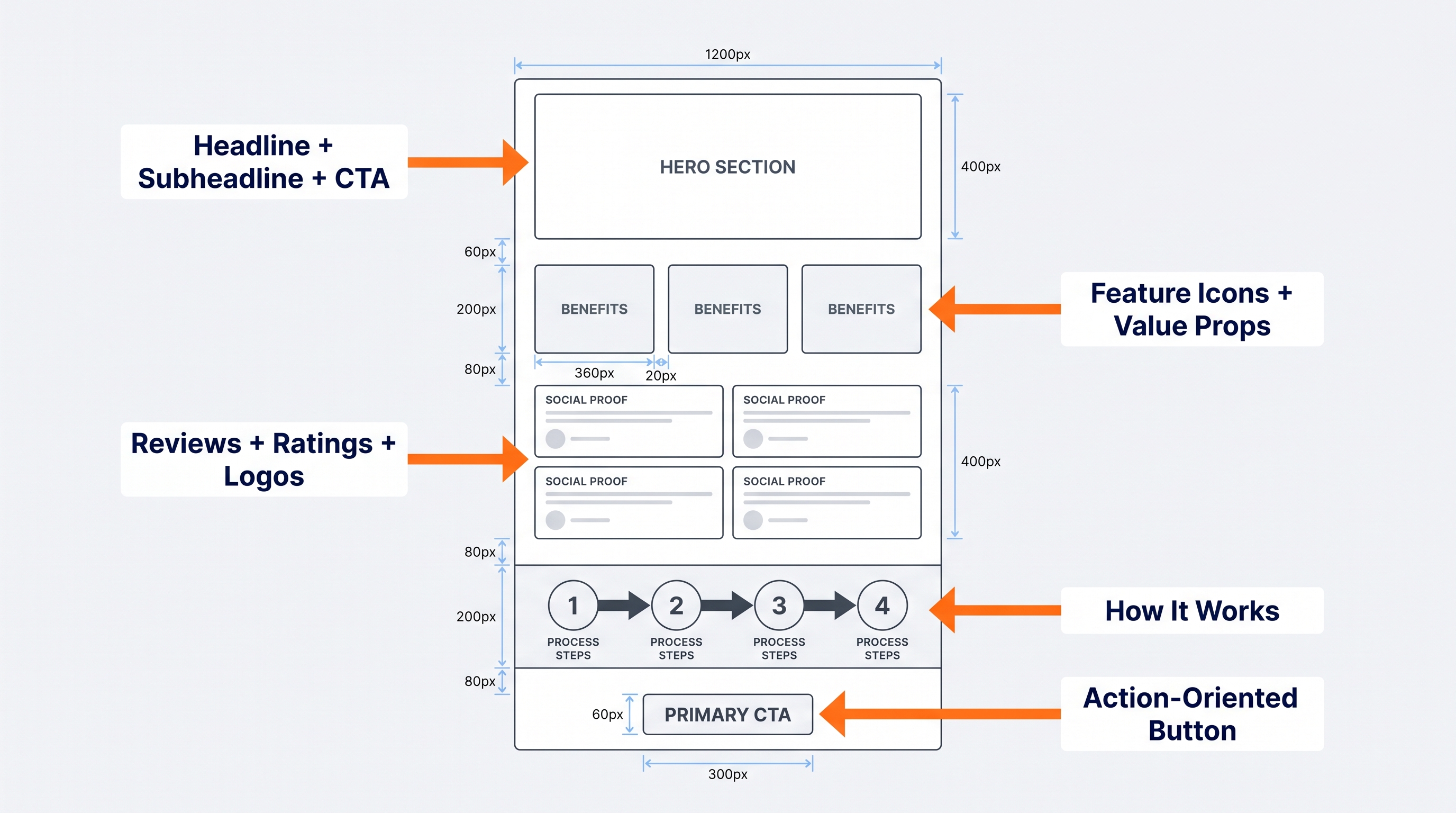
Landing Page Structure Checklist
Benefit-driven headline that speaks to a specific outcome
Clear primary CTA above the fold
Problem statement that resonates with visitor pain points
Benefits section focused on outcomes, not features
Social proof with specific testimonials and recognizable logos
How it works section with clear, realistic steps
Risk reversal element (guarantee, trial, audit)
Secondary CTA for visitors not ready to commit
Essential Elements Every Service Landing Page Must Include
Some elements are non-negotiable. Miss any of these, and your conversion rate suffers. Period.
Headlines matter more than you think. Most landing pages open with something forgettable like "Welcome to Our Services" or "We Help Businesses Succeed." That's not a headline. That's filler. A real headline states a specific benefit or outcome: "Double Your Qualified Leads in 60 Days" or "Get Your First 100 Customers Without Paid Ads."
Your CTA button is not a submit button. It's a commitment point. "Submit" tells me nothing. "Get My Free Audit" tells me exactly what happens next and why I should care. Every CTA should answer: what do I get, and what happens when I click?
Must-Have Landing Page Elements
Benefit-driven headline (not company-focused)
Trust indicators: certifications, awards, client logos
Mobile-first responsive design
Fast load time (under 3 seconds)
Clear, action-oriented CTA copy
Social proof with specifics (names, companies, numbers)
Minimal form fields (ask only what you need)
Speed kills conversions. A one-second delay in page load time can reduce conversions by as much as 7%. Most businesses don't realize they're losing 7% of their revenue because their hero image is 4MB instead of 400KB.
And mobile isn't optional anymore. More than half your traffic is on mobile. If your landing page doesn't work perfectly on a phone, you've already lost.
Pros
Short forms (2-3 fields) convert at higher rates
Less friction means more completions
Better for top-of-funnel lead capture
Works well for low-commitment offers
Cons
Short forms attract lower-quality leads
Less qualification data for sales team
Higher volume but lower intent
May require additional nurturing
Conversion Optimization Strategies That Actually Work
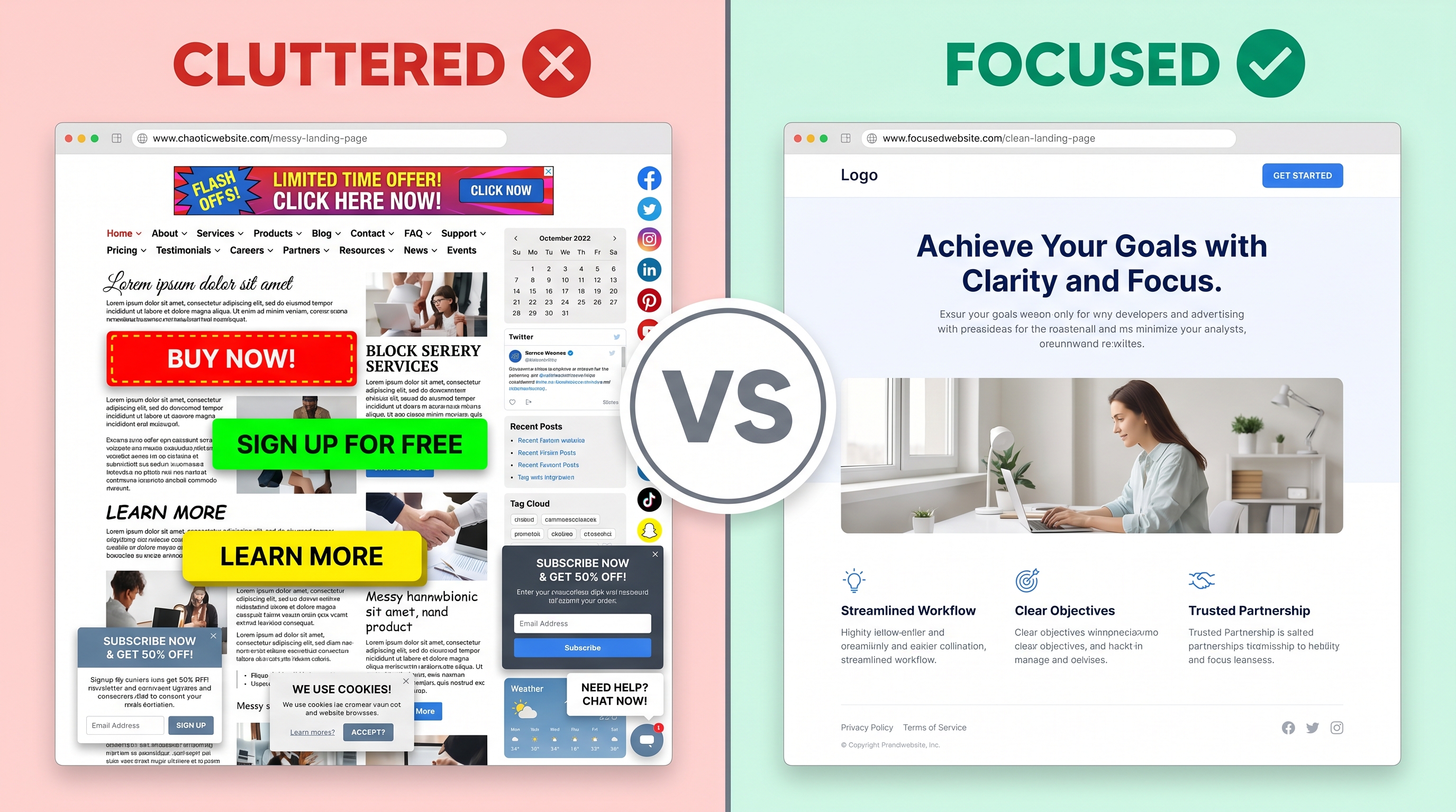
Most landing pages fail because they're trying to do too much. Multiple CTAs. Links to other pages. Navigation menus. Blog sidebars. Every exit point is a conversion killer.
High-converting pages have a single conversion goal. One action. One path. Everything else is a distraction.
Remove navigation menus. If someone can click away to your About page, they will. And they won't come back.
Kill competing CTAs. Don't ask people to download a guide AND book a call AND sign up for a newsletter. Pick one.
Use visual hierarchy. The most important element (your CTA) should be the most visually prominent. Use size, color, and whitespace to guide attention.
Optimize above the fold. 80% of visitors never scroll. Your hero section must work as a standalone pitch.
Contrast matters. Your CTA button should pop against the background. If it blends in, it's invisible.
Color psychology is real, but it's not magic. Red doesn't automatically convert better than blue. What matters is contrast and context. A red button on a red background is useless. A red button on a white background with plenty of whitespace? That works.
Whitespace isn't wasted space. It's breathing room. It guides the eye. It makes your page feel less cluttered and more trustworthy. Cramming everything above the fold doesn't increase conversions. It increases cognitive load and kills trust.
Writing Copy That Converts: The Service Landing Page Formula
Most landing page copy is written from the company's perspective. "We provide," "Our services include," "We help businesses." That's backwards.
High-converting copy is customer-centric. It's about them, not you. "You'll get," "Your team will," "You'll see results." The reader is the hero. Your service is the tool that helps them win.
Specificity builds credibility. 'Increase conversions' is vague. 'Get 40% more qualified leads in 90 days' is a claim I can evaluate and believe.
Prithvi Jadwani, TechDevs
Address objections before they become reasons to leave. If price is a common concern, talk about ROI. If trust is an issue, lean harder on social proof. If complexity scares people, simplify your process section. Every objection you leave unaddressed is a conversion you lose.
Use Power Words Carefully
Words like 'proven,' 'guaranteed,' 'exclusive,' and 'limited' trigger emotional responses. But overuse them and you sound like a scam. Use them when you can back them up.
Benefit Stacking Works
Don't just list one benefit. Stack them. 'You'll save 10 hours per week, reduce errors by 30%, and free up your team to focus on strategy.' Multiple benefits compound the perceived value.
CTA Copy Clarity
Your CTA should tell visitors exactly what happens next. 'Get Started' is vague. 'Book Your Free Strategy Call' is specific and low-risk.
Speak Their Language
Use the exact words your customers use to describe their problems. If they say 'we're drowning in manual tasks,' don't say 'inefficient workflows.' Match their language.
And cut the fluff. Every sentence should move the reader closer to action. If it doesn't, delete it.
Leveraging AI and Automation for Landing Page Optimization
AI isn't replacing landing page optimization. It's making it faster and more precise. But only if you use it right.
Personalization at scale is where AI shines. You can show different headlines, different testimonials, and different CTAs based on where the visitor came from, what device they're on, or what industry they're in. A visitor from LinkedIn sees different social proof than one from Google Ads.
AI-powered A/B testing runs multiple variants simultaneously and automatically allocates traffic to winners. You're not waiting weeks for statistical significance.
Chatbots can qualify leads in real-time, answer objections, and book meetings without human intervention. But a bad chatbot is worse than no chatbot.
Predictive analytics identify high-intent visitors based on behavior patterns and can trigger personalized offers or alerts to your sales team.
Dynamic content changes based on traffic source, time of day, or user behavior. A returning visitor sees a different message than a first-timer.
AI copywriting tools can generate dozens of headline variants for testing. They're not replacing writers, but they speed up ideation.
But here's the thing: AI is a tool, not a strategy. It can test faster, personalize better, and analyze deeper. But it can't replace understanding your customer, crafting a compelling offer, or building trust.
Testing, Measuring, and Improving Your Service Landing Page
Conversion rate is important, but it's not the only metric that matters. A page with a 10% conversion rate that attracts terrible leads is worse than a 5% page that brings in qualified buyers.
Track bounce rate. If 80% of visitors leave immediately, your message match is broken or your page loads too slowly. Track time on page and scroll depth. If no one scrolls past the hero, your opening isn't compelling enough.
Common Landing Page Testing Questions
What is the ideal length for a high-converting service landing page?
Long enough to answer objections, build trust, and explain the value. For complex services, that might be 3,000+ words. For simple offers, 800 words might be enough. Test both. Some audiences prefer detail, others want speed.
How many CTAs should a service landing page have?
One primary CTA repeated 2-3 times at strategic points (hero, after benefits, after social proof). Optionally, one secondary CTA for visitors not ready to commit (like 'Download our guide'). More than that creates decision paralysis.
Should service landing pages include navigation menus?
No. Every link away from the page is a potential lost conversion. If someone wants to learn more about your company, they can do that after they convert. Keep them focused on one action.
What's the difference between a service landing page and a service page?
A service page lives on your main website, has navigation, and provides comprehensive information. A landing page is a standalone conversion tool with a single goal and no distractions. Landing pages are for campaigns. Service pages are for education.
How fast should a landing page load for optimal conversions?
Under 3 seconds. Ideally under 2. Every additional second increases bounce rate and kills conversions. Compress images, minimize code, use a CDN, and lazy-load non-critical elements.
What conversion rate should I expect from my service landing page?
Industry average is 2.35%. Anything above 5% is solid. Above 10% is excellent. But context matters. A high-ticket service with a long sales cycle might convert at 3% and still be wildly profitable. Compare yourself to your own baseline, not generic benchmarks.
How often should I A/B test my service landing page?
Continuously, but not recklessly. Test one element at a time (headline, CTA, hero image). Wait for statistical significance before declaring a winner. Run 2-3 tests per quarter at minimum. More if you have high traffic.
Set up proper conversion tracking. Not just form submissions, but qualified leads and closed deals. A landing page that generates 100 leads worth $10,000 beats one that generates 200 leads worth $3,000.
Use heatmaps and session recordings. They show you where people click, where they hesitate, and where they abandon. This qualitative data tells you why your conversion rate is what it is.
Continuous Optimization Calendar
Month 1: Test headline variations
Month 2: Test CTA button copy and placement
Month 3: Test hero image or video
Month 4: Test form length and fields
Month 5: Test social proof placement and format
Month 6: Review all winning tests and implement compound page
Know when to iterate versus rebuild. If your conversion rate is 1%, tweaking button colors won't save you. You need a new page. If you're at 8% and want to hit 10%, iteration works. Be honest about which situation you're in.
Ready to Build a Landing Page That Actually Converts?
Stop losing 88% of your traffic to poorly designed landing pages. We'll build you a conversion-optimized service landing page backed by psychology, data, and 10+ years of experience turning visitors into customers.